


SERVICE
Brand Photography / Brand Guidelines aBranding/ storytelling concept /copywriting / VISUAL IDENTITY / package design / graphic design / ILLUSTRATION / social media strategy / pos
CLIENT
JAAKKOLAN ELINTARVIKETUKKU
YEAR
2021
Outokumpu is the global leader in sustainable stainless steel. Their customers use stainless steel to build bridges and buildings, produce cars, trains and trucks, and manufacture household appliances and utensils. Outokumpu is known in the market for their unmatched expertise in stainless steel as well as the quality of their products.
MacWell worked with Outokumpu’s brand and communications team to develop and produce engaging materials to fuel pride in employment, help raise interest in new products and support Outokumpu’s position as a global leader in stainless steel.
MacWell worked with Outokumpu’s brand and communications team to develop and produce engaging materials to fuel pride in employment, help raise interest in new products and support Outokumpu’s position as a global leader in stainless steel.

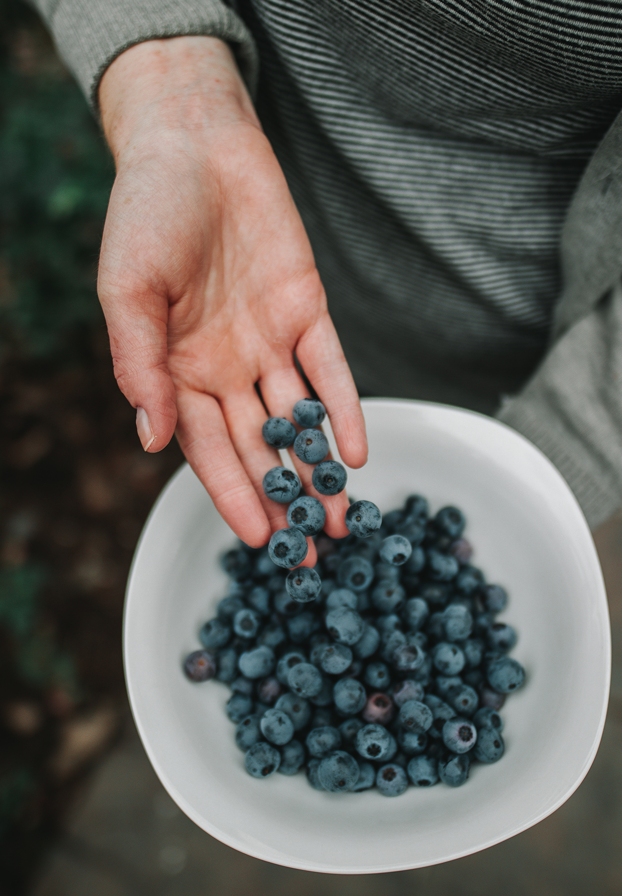


What’s in a name? Everything. Karelian aarre – The Treasure of Carelia describes these berries as they should be seen: riches of the land, provided to us by our forests and fields. The name also sets the product line apart from all other products of the same category.

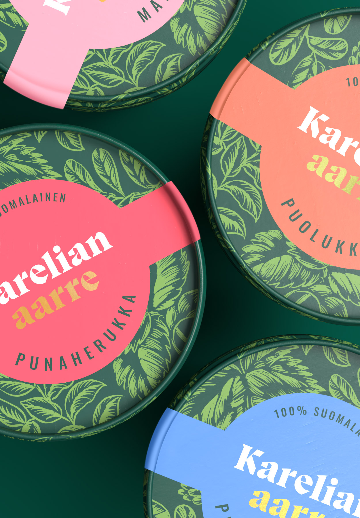


The brand colours and illustrations reflect shades of forest green and the freshness of new sprouts emerging from fruitful ground. To give the visuality a royal twist, we added some gold foil to emphasize the value of the berries.


