SERVICE
Product Messaging / Marketing Toolkits / 2D Animation / Film Direction / Film Production
CLIENT
Qt Group
YEAR
2022
Qt Group is a globally recognized software company with over 1.5 million developers worldwide trusting the company. They help increase productivity in all stages of the software development lifecycle, from UI design and software development to quality management and deployment.
Qt Group presented MacWell with a wonderful challenge - to create a series of videos with a distinct visual identity that reflected the unique features of their Qt Design Studio software.
Qt Group presented MacWell with a wonderful challenge - to create a series of videos with a distinct visual identity that reflected the unique features of their Qt Design Studio software.

Qt Design Studio helps turn your designs into functional code that works on any platform or device. It bridges the gap between designers and coders.
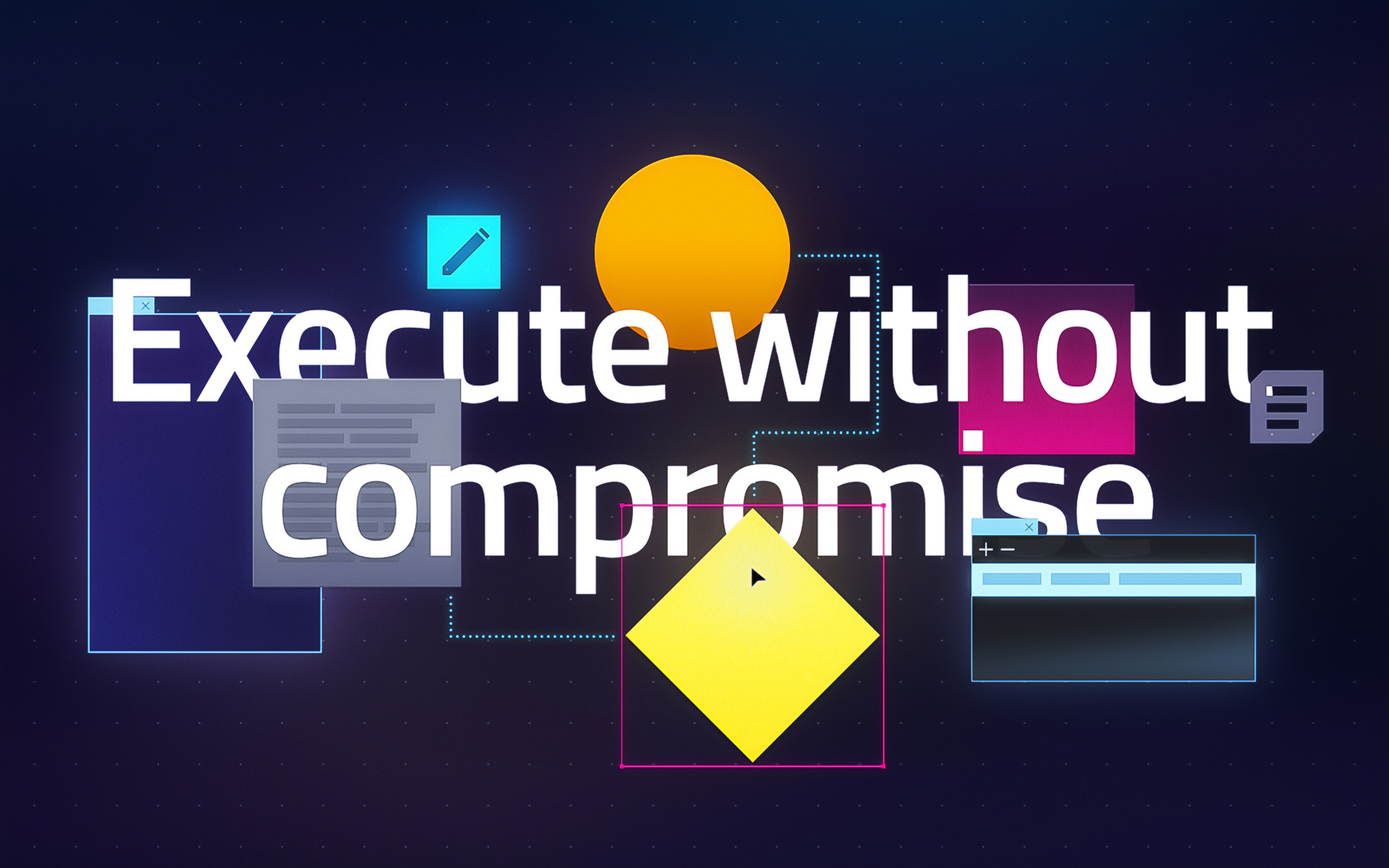
The look of the videos had to be striking and distinctive, while still reflecting the user experience. Through experimentation, we found ways to stylize and simplify the visuals while still maintaining the unique feel of the software.
The look of the videos had to be striking and distinctive, while still reflecting the user experience. Through experimentation, we found ways to stylize and simplify the visuals while still maintaining the unique feel of the software.

We wanted to make viewers feel as though they were stepping into the app, experiencing the space between design and code. To achieve this, we designed windows and elements that float freely in a three dimensional space.

We established a clear hierarchy, with four types of design elements to keep the visual language sharp.
The colors also have clearly defined purpose: blue for design, yellow for code, and grey for inactivity. We used dark windows and light designs to create contrast, living bold gradients represent dynamism and active elements emit light in the dark.
The colors also have clearly defined purpose: blue for design, yellow for code, and grey for inactivity. We used dark windows and light designs to create contrast, living bold gradients represent dynamism and active elements emit light in the dark.


SIMILAR PROJECTS


