SERVICE
Brand Identity / Brand Naming / Brand Messaging/ Visual Identity / Tone of Voice / Brand Guidelines
CLIENT
Sizey
YEAR
2020
Introducing, Sizey – the innovative company which has developed a tool for more accurate body size measuring for online shopping of clothing. Authentic 3D body modelling gives people the power to find the perfect fit for their own shape and size, and helps reduce logistics of returned items.
The challenge of Sizey was how to make their intricate technology understandable to the user. So everything needed to be based on showcasing the simple steps of Sizey measuring. Sizey was also a newborn company, and in addition to brand identity, they needed our help in establishing a market roll-out strategy.
The challenge of Sizey was how to make their intricate technology understandable to the user. So everything needed to be based on showcasing the simple steps of Sizey measuring. Sizey was also a newborn company, and in addition to brand identity, they needed our help in establishing a market roll-out strategy.
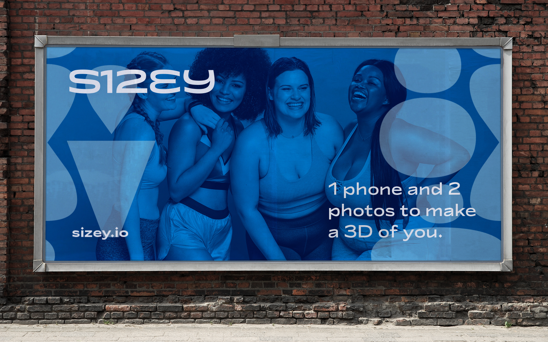
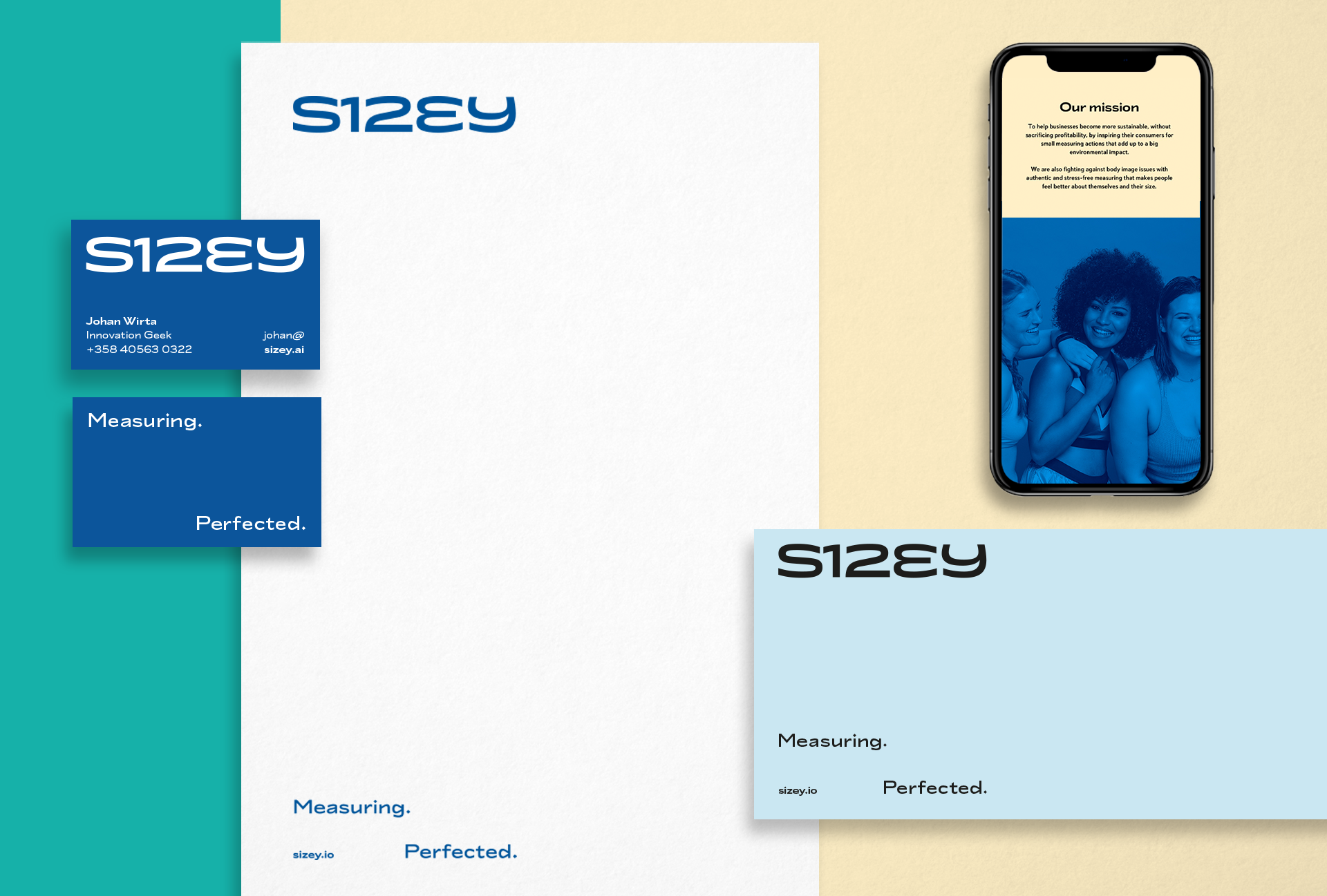
We began our work by crystallizing the brand foundation. In a thorough brand workshop, we defined the strategy on how to get the new brand to communicate on three different target levels: the needed investors, the B2B clients, and the actual consumers.

One Sizey fits all.
The friendly and reassuring tone of voice was then applied to all the brand messaging, which we made sure conveyed a sense of usability and trustworthiness.
Through the brand voice, we also generated marketing assets along with key selling points for our roll-out strategy and the brand’s initial introduction to the market.
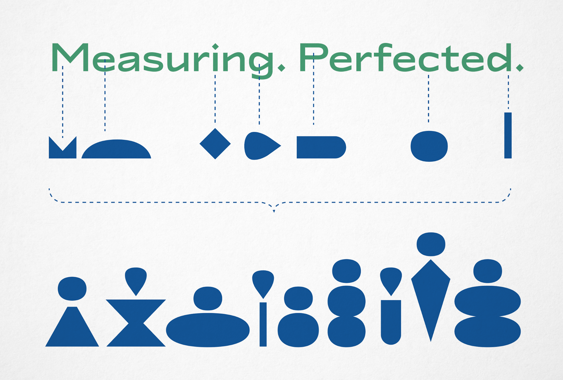
To visualize the philosophy of inclusivity for all body types and body positivity, we created a library of shapes, each representing a person. The shapes were derived from the brand font to seamlessly match the form language of the visual identity. We wanted these shapes to be playful, so we created a fluid morphing animation of them, where each shape gets their turn ”in the spotlight.”
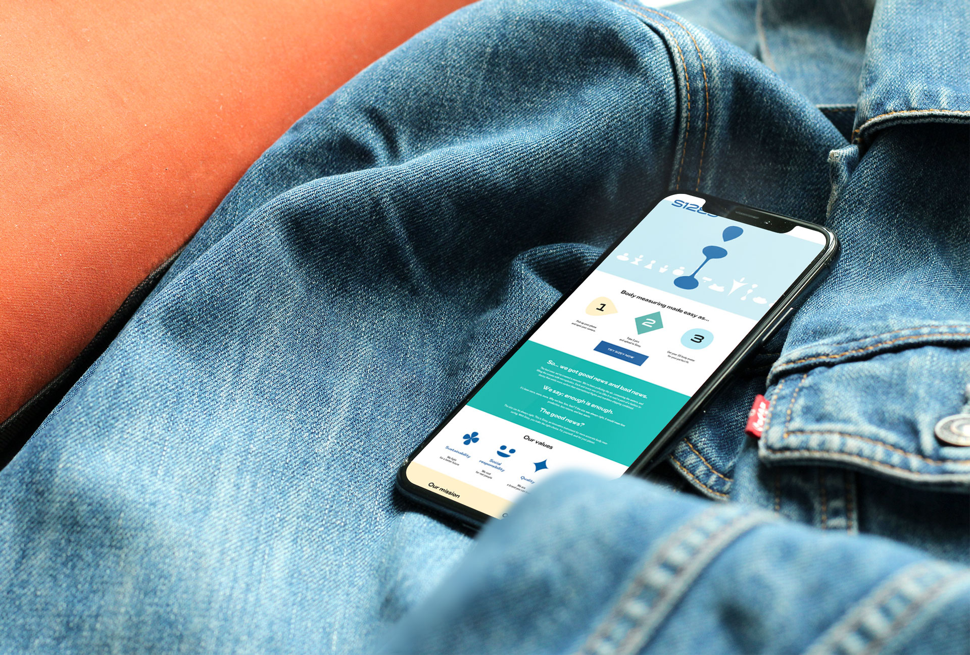

Following this same principle, we created a logo so it has two variables – weight and width. It can stretch, bulk up, or get thinner and narrower as needed. The basis for the logo came from Sizey’s manifesto of ease of use of the product: Making a 3D of yourself is as easy as 1,2,3.
To visually perfect the logo, we customized the brand font to have a set of numerals specifically created for Sizey – which, of course, also follow the same principles of weight and width as the logo itself.
To visually perfect the logo, we customized the brand font to have a set of numerals specifically created for Sizey – which, of course, also follow the same principles of weight and width as the logo itself.

SIMILAR PROJECTS


